Design Strategy
February 5, 2025
In UX design, onboarding is the process of helping your users learn how to use your products. As a product designer and a consumer, I find onboarding annoying.
Countless times, the consumer version of me has signed up for a new app, excited to start using it, only to be forced to go through tedious step-by-step tutorials that I retain zero information from. Countless times, the designer version of me has been asked to design an onboarding flow for new users so that they can learn to use the product ASAP.
Don’t get me wrong — it is totally valid to want users to ease into a new product and discover the wonderful features that we created for them, but how have we gotten onboarding so wrong, so boring, and so ineffective?
Before diving into design patterns, let’s break down what an effective onboarding experience should look like.
In my previous designs, I’ve used some commonly established onboarding patterns that in retrospect are not effective because they do not meet the criteria above. Below are some examples.
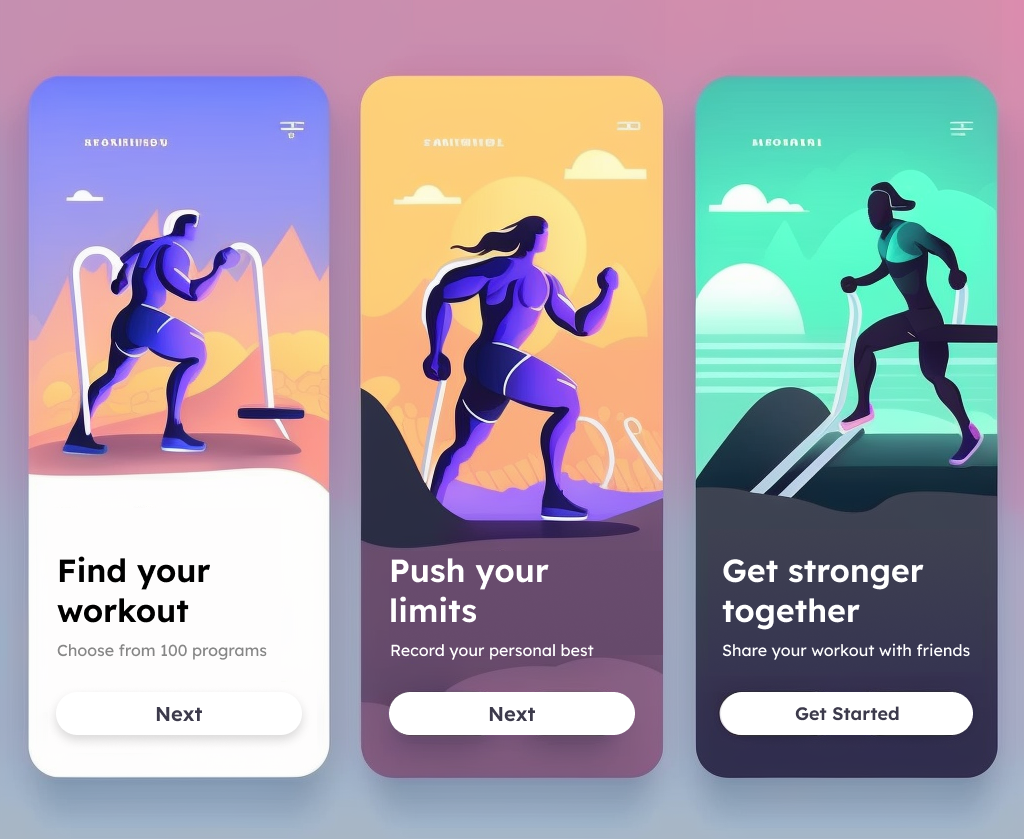
Like many, I’ve used full-size onboarding screens. It's a popular pattern because it gives designers and companies a chance to flaunt their illustration style, showcase their brand, and demonstrate their uniqueness. However, the fact that the average page view times were consistently low on these pages showed me that the screens weren’t useful because
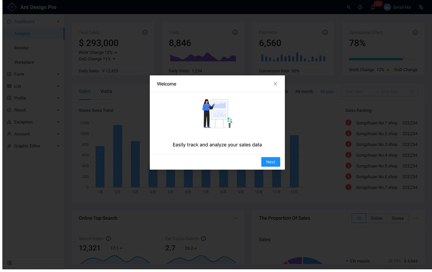
Modal overlays placed in the center of the screen are used to welcome new users or more commonly, to introduce new features to existing users. However, they are not effective because
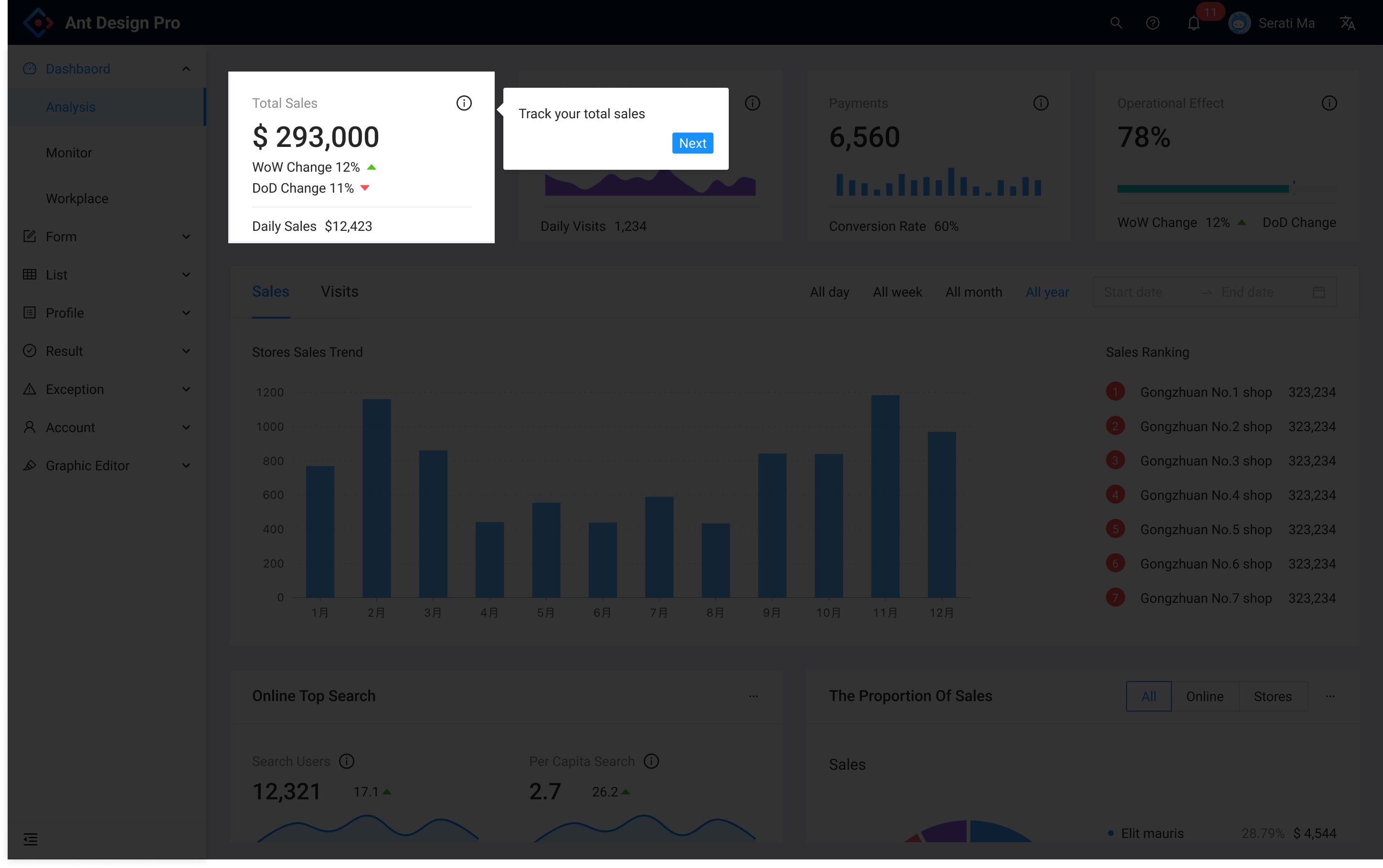
These product tours usually require users to follow tooltips around the UI to learn what each section and button do.
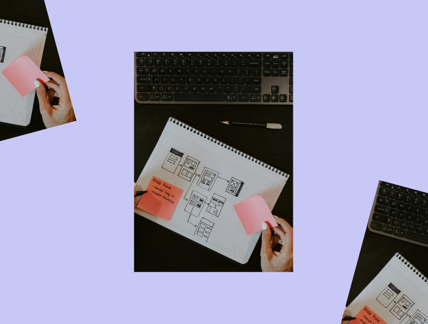
We often prioritize designing the actual feature, and right before we finish designing, we or someone on our team think it’d be a good idea to add an onboarding flow.There’s nothing wrong with that idea, but the timing is unfortunate. When we are at the tail end of the project, we tend to rush to get the design done, and the design process of the onboarding flow suffers. We don’t do as much research and user testing while designing, and we rely too much on the established-but-not-effective patterns as the ones mentioned above.
When you feel like a feature is complicated and we need an onboarding flow to help users learn how to use the feature, it’s usually an indicator that the feature is not well designed. Many times, instead of going back and iterating on the feature design, we resort to adding on an onboarding flow to teach users, thinking that will fix the problem.
We tend to think of onboarding as a separate user flow from the actual product experience. However, I would argue that good onboarding should feel invisible, as it's built into the product experience.
We should grant users the freedom to explore various features of the product by themselves. If, and only if a particular feature is complex and you think some handholding will be helpful, then you can use explanation patterns such as tooltips to provide more guidance.
The trick, however, is to not overdo it. Keep the explanation succinct and link out to product documentation if you have it so that the tooltip provides enough information for users to figure out things by themselves and offers extra help if users need it.

Empty states offer the perfect real estate to provide meaningful product education. For example, when a new user started using Figma, instead of seeing no files at all, Figma has default files to showcase its functionalities. Similarly in Notion, when you use a new template, placeholder texts that provide content suggestions are placed in the template for additional guidance.These onboarding experiences are clever because they are not intrusive and they are built as a part of the product experience.

To design for onboarding, at its core, is to design for a new user experience. When we call it “onboarding”, we imply that it's a siloed and one-off experience with a single goal of knowledge transfer to new users.
What makes up a new user’s experience, however, is a lot more than that. It’s the initial excitement of trying out a new product, it’s the curiosity of figuring out how we can best use the product, and it’s the sense of satisfaction of learning something new. Therefore, when creating an experience for a new user, the goal is to bring out these delightful moments and help users relish these feelings.
When we reframe onboarding to new user experience, it also reminds us of the importance of going through the proper design process — creating designs based on well-researched personas, validating your designs through user testings, and tracking results to keep ourselves honest.
Related articles
.svg)
.svg)
By subscribing, you agree to receive emails from Koi Studios. Unsubscribe anytime using the link in our emails.


